Selene was a sustainable birth control packaging solution developed by a team of four ITP business and engineering students, including myself as the designer. We aimed to create a more user-friendly, eco-conscious alternative for the AmeriStar Packaging Awards competition, seeking to improve both functionality and environmental impact.
Date 2019
Final Packaging & Design
Final Ideations
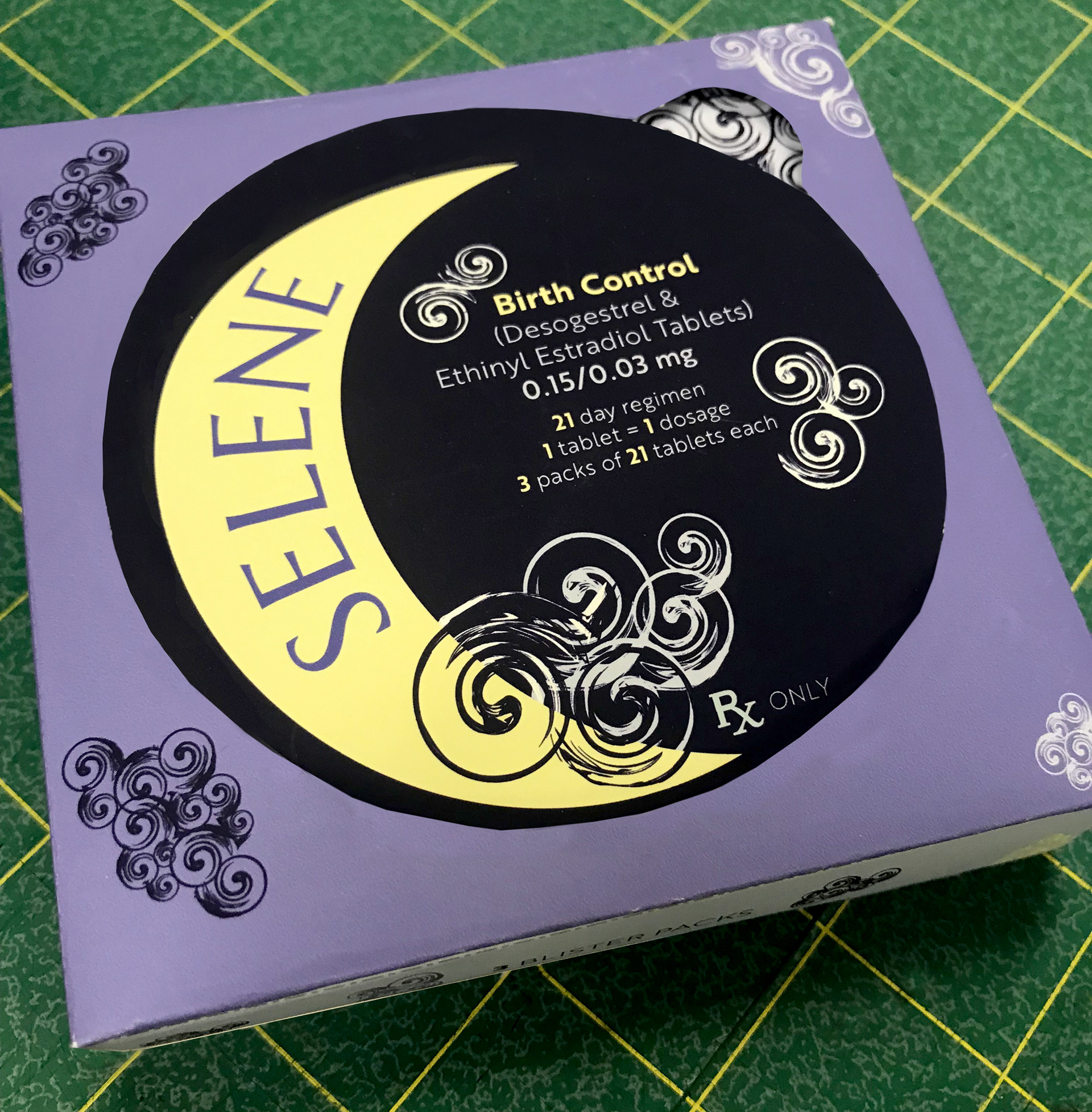
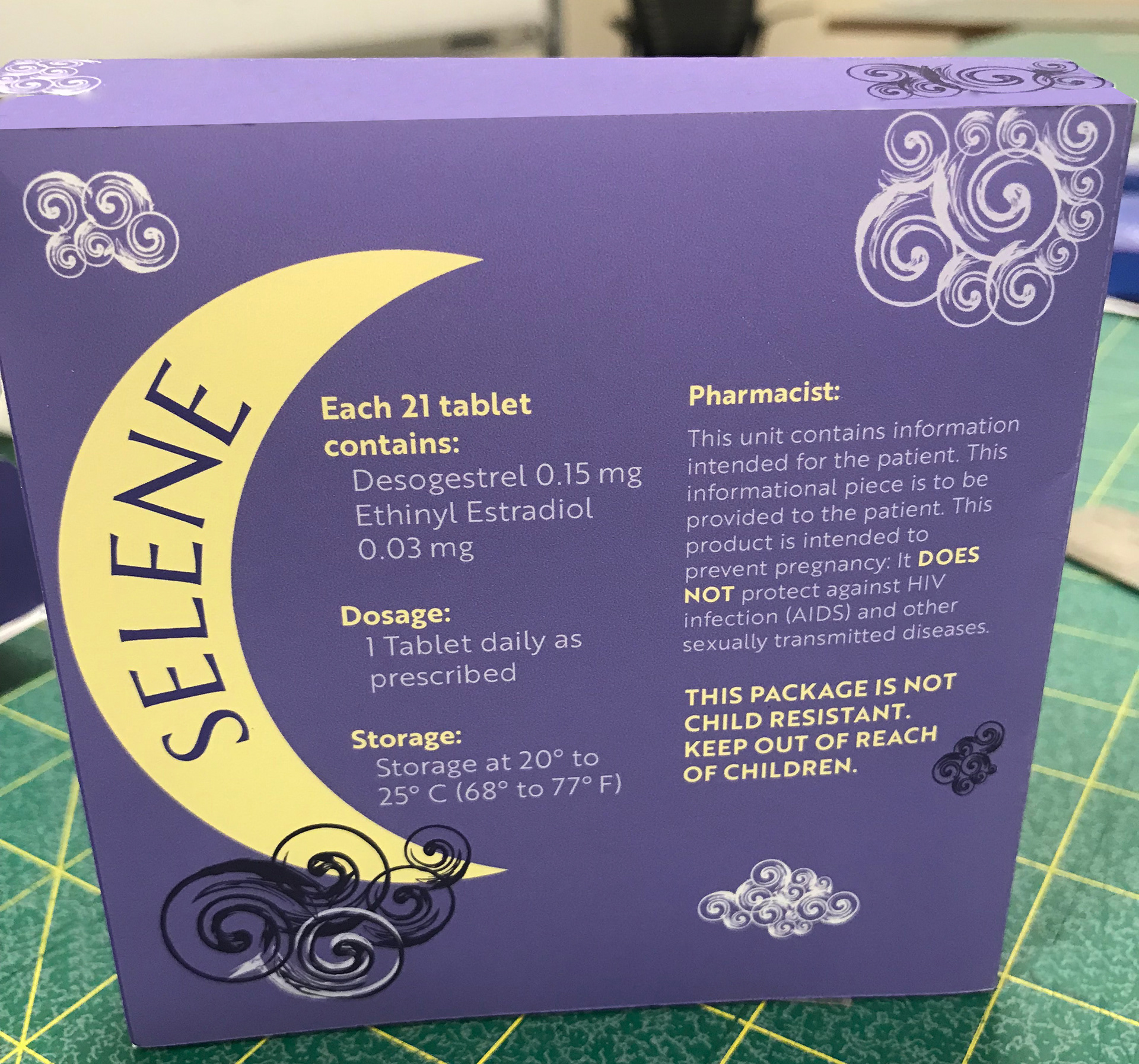
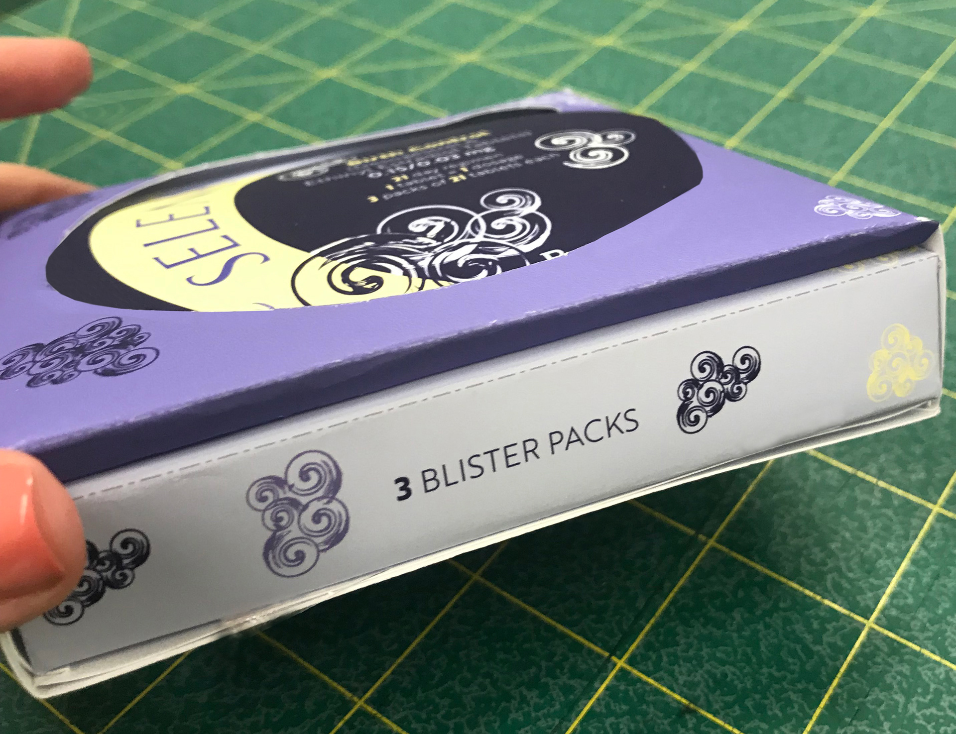
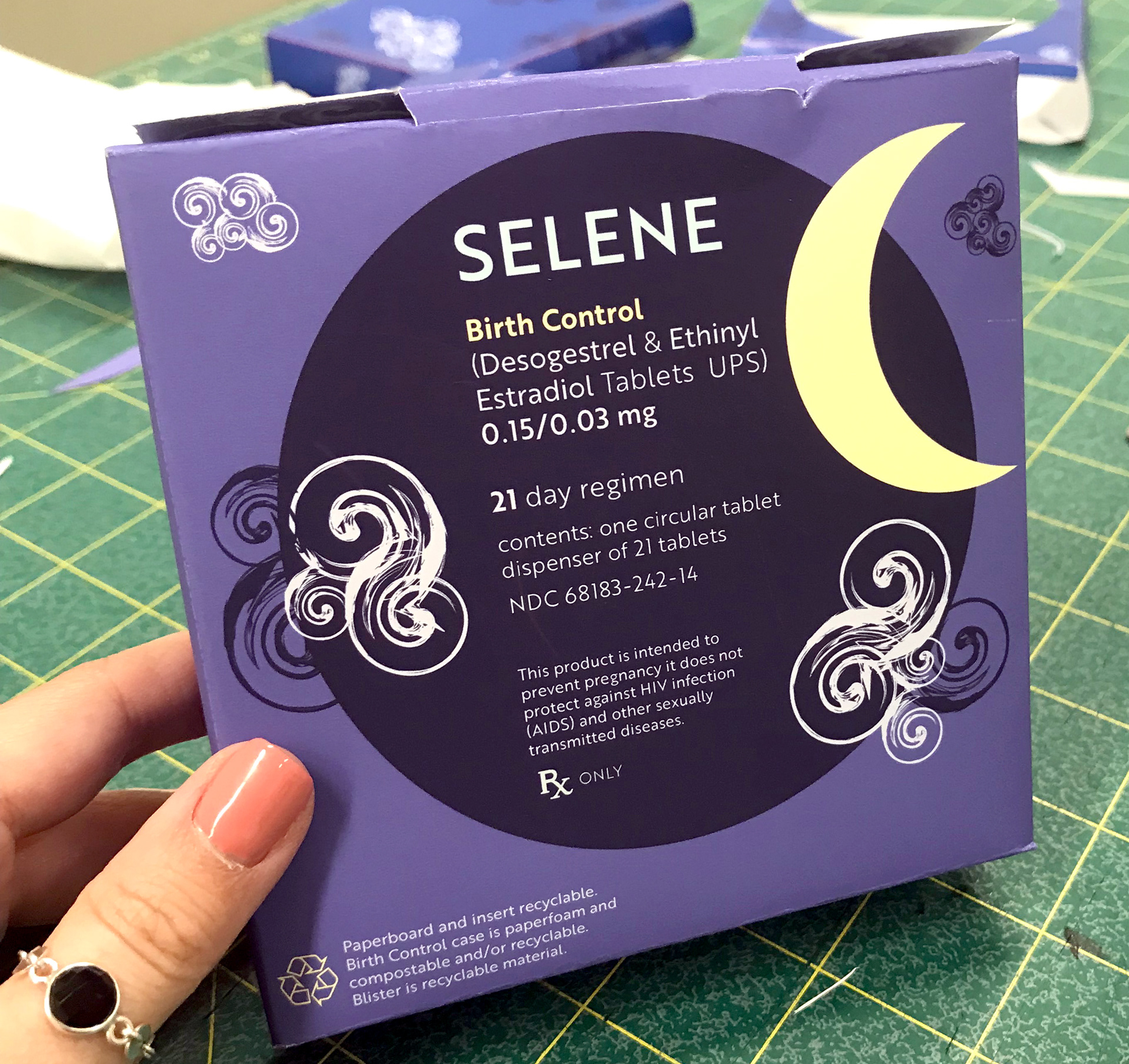
For the final iteration of the packaging design, I adhered to the midnight color palette to evoke a sense of elegance and tranquility. I chose a clean, modern sans-serif typeface to further complement the sophisticated and minimalistic aesthetic. Incorporating the moon and cloud motifs, I aimed to create a design that subtly referenced the lunar cycle while being visually appealing and relevant. The goal was to produce packaging that wasn’t immediately recognizable as birth control, allowing the consumer to carry it discreetly without drawing attention in public. By moving away from the typical sterile and clinical look of medical packaging, I wanted the product to feel more like a desirable object—something the user would be inclined to keep and use regularly. Ultimately, I was pleased with how the final product came together, achieving both functionality and elegance while maintaining a sense of discretion and personalization.
Packaging & Compact Design Ideas
Design Ideations
These are the physical compact design and packaging ideations for our project, where we drew inspiration from the concept of cycles, particularly the lunar cycle, to symbolize menstruation. We initially considered the names "Mond" (German for moon) and "Luna" (Spanish for moon) as potential candidates. Ultimately, we settled on "Selene," named after the Greek goddess of the moon, which felt most fitting given the connection between the moon and Greek mythology.
For the design, I incorporated elements like clouds, the moon, and stars, all reflecting the celestial theme that resonated with the name "Selene." The color palette was deliberately soft and atmospheric, with shades reminiscent of midnight and dusk, and after careful consideration, we chose "midnight" as the defining color. The aim was to evoke a serene, calm feeling while aligning with the symbolism of the moon's phases and their connection to the menstrual cycle.
Ideas & Processing on Selene
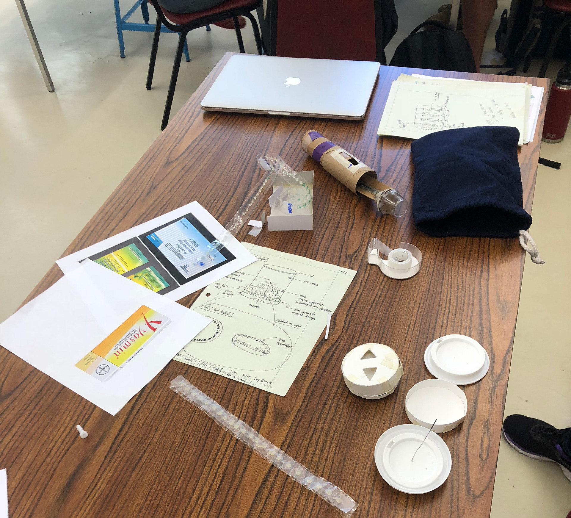
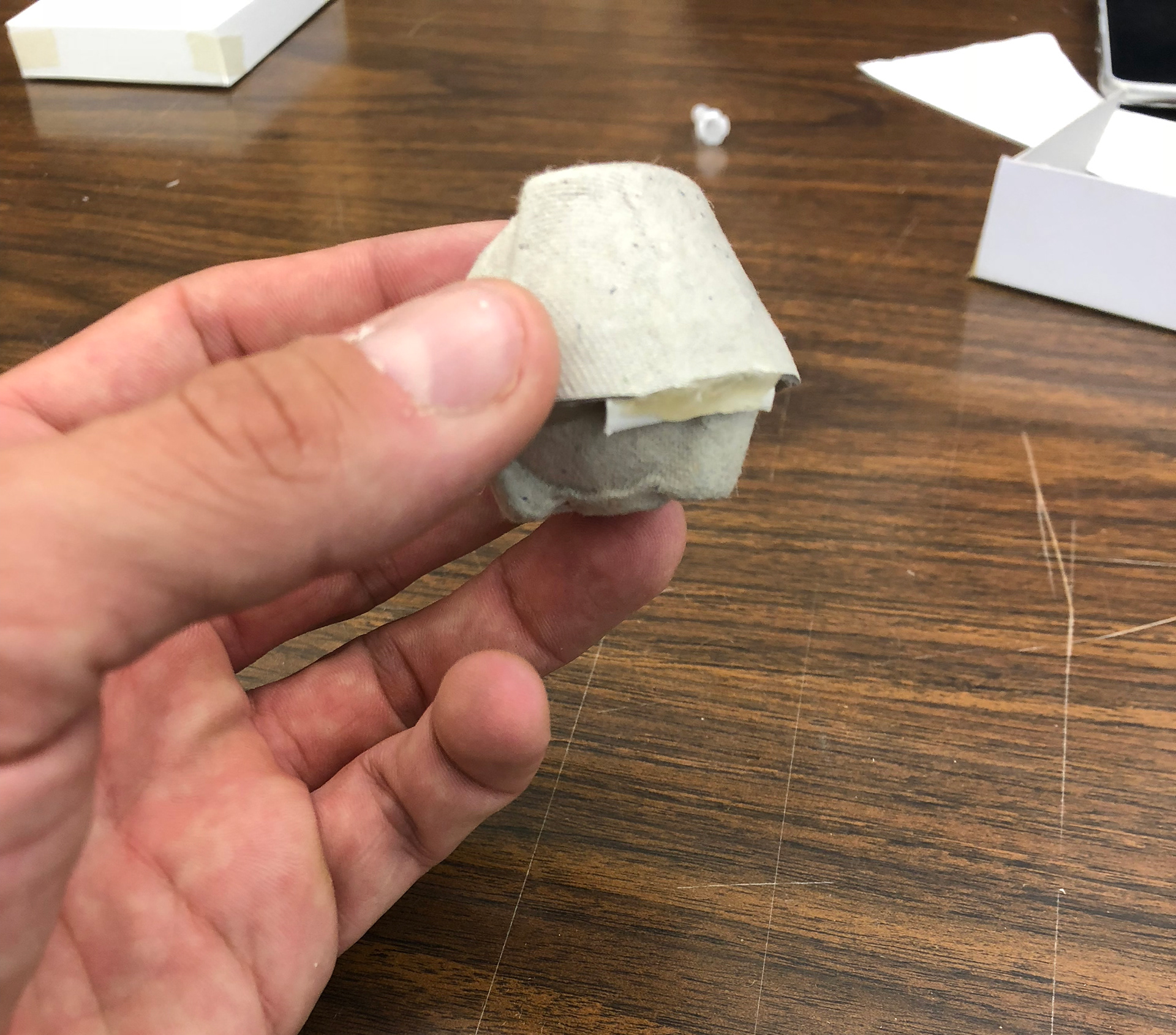
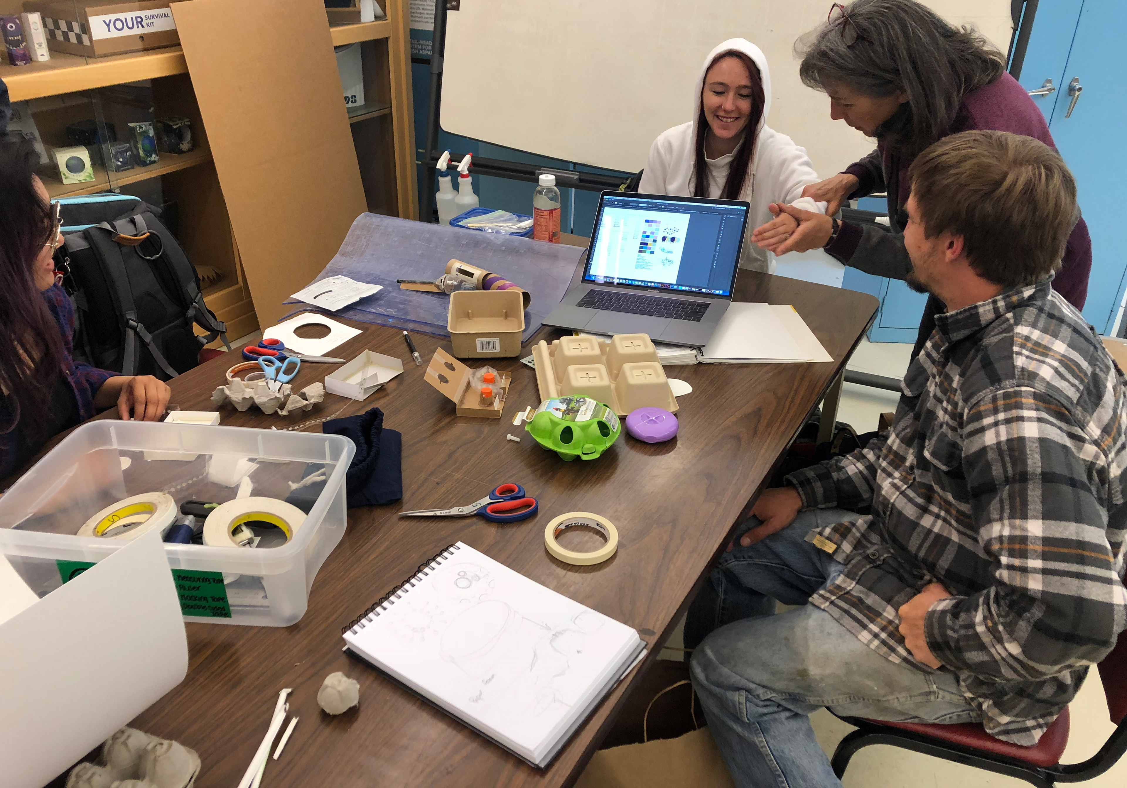
Physical Ideations
The first round of physical ideations and prototyping with the team.
Identity System
Summary
This project was a passion-driven initiative for my senior design showcase, where I collaborated with a multidisciplinary team of students from ITP and engineering fields. As the sole graphic and brand designer, I contributed to the creation of a sustainable and innovative packaging solution for AmeriStar, a project Cal Poly participates in annually, focusing on product sustainability and innovation.
Together, we conceptualized an eco-friendly approach to birth control packaging, aiming to eliminate excess waste and packaging. Our solution involved creating a reusable, easily refillable container that would reduce its environmental footprint. We wanted to push the boundaries of traditional medication packaging, designing something innovative and forward-thinking that could set the standard for the future of sustainable pharmaceutical packaging.