C Squared Social is a design and marketing agency located in San Diego, CA. I worked there for almost three years. During my time there, I worked with clients in the beauty space, healthcare, mining, medspa, e-commerce, finance, tech, industrial, real estate, franchising, and frankly, anything you could think of. In the span of working there, I had about 100 clients or more. Not only did I work with clients, but also worked on the company's internal deliverables as well. Here you will see some of those internal deliverables.
Dates 2022 - 2024
C Squared Website Video
Summary
This is my snippet from the opening video of the website, a collaborative project developed by the entire design team. Each designer contributed a segment to the video, showcasing their individual design style while emphasizing the diverse perspectives and creative approaches at C Squared. This effort highlighted how each designer’s unique contributions align with the agency’s overall vision, reflecting both personal flair and the collective identity of the team.
Duration & Deliverables & Tools
The whole project overall took a week but my part took me about 4 hours to create. I had to deliver 3 frames. Photoshop and AfterEffects were used as well as my Nikon Z50 camera.
Concept and Production
For this project, I wanted to craft a dynamic and playful collage, layering textures and imagery drawn from my own photography and personal work. My goal was to infuse the piece with personality and taste, moving away from anything bland, predictable, or corporate. While I’m used to designing within strict brand guidelines, this was an exciting opportunity for creative freedom. The only requirements were to prominently feature the C Squared logo and create three slides for the video compilation.
In production, I used a variety of sourced and custom textures, blending overlays to achieve a rich, layered look, and incorporating photography from past events and personal projects. After designing each slide in Photoshop, I moved them into After Effects, adding music to finalize this unique piece for the overall video compilation.
Content
Summary
These are some of the internal content Instagram posts I created for the company's feed. Each month, each designer was requested to create a post for the feed that could be anything they wanted as long as it fit into the company's brand and showcased their individualism as designers.
Duration & Deliverables & Tools
Each post was created within 1 to 2 hours, and I would do it in between client projects whenever I had downtime in the day. I'd have to deliver a post each month. Photoshop was used to create these posts.
Concept and Production
Each post was driven by a unique concept, yet my design style and perspective are evident throughout. I gravitate toward collage, layered textures, and photography, often embedding messages where possible. The posts include a range of themes—from clean representations of the brand to elements associated with San Diego, warm holiday messages, and personal touches like my own photography and even my eye featured in a designer-focused post. I aim to be experimental, blending different styles and ideas while staying true to my creative voice. Photoshop was my primary tool, and many of the photos were captured on my own camera.
Emails
Summary
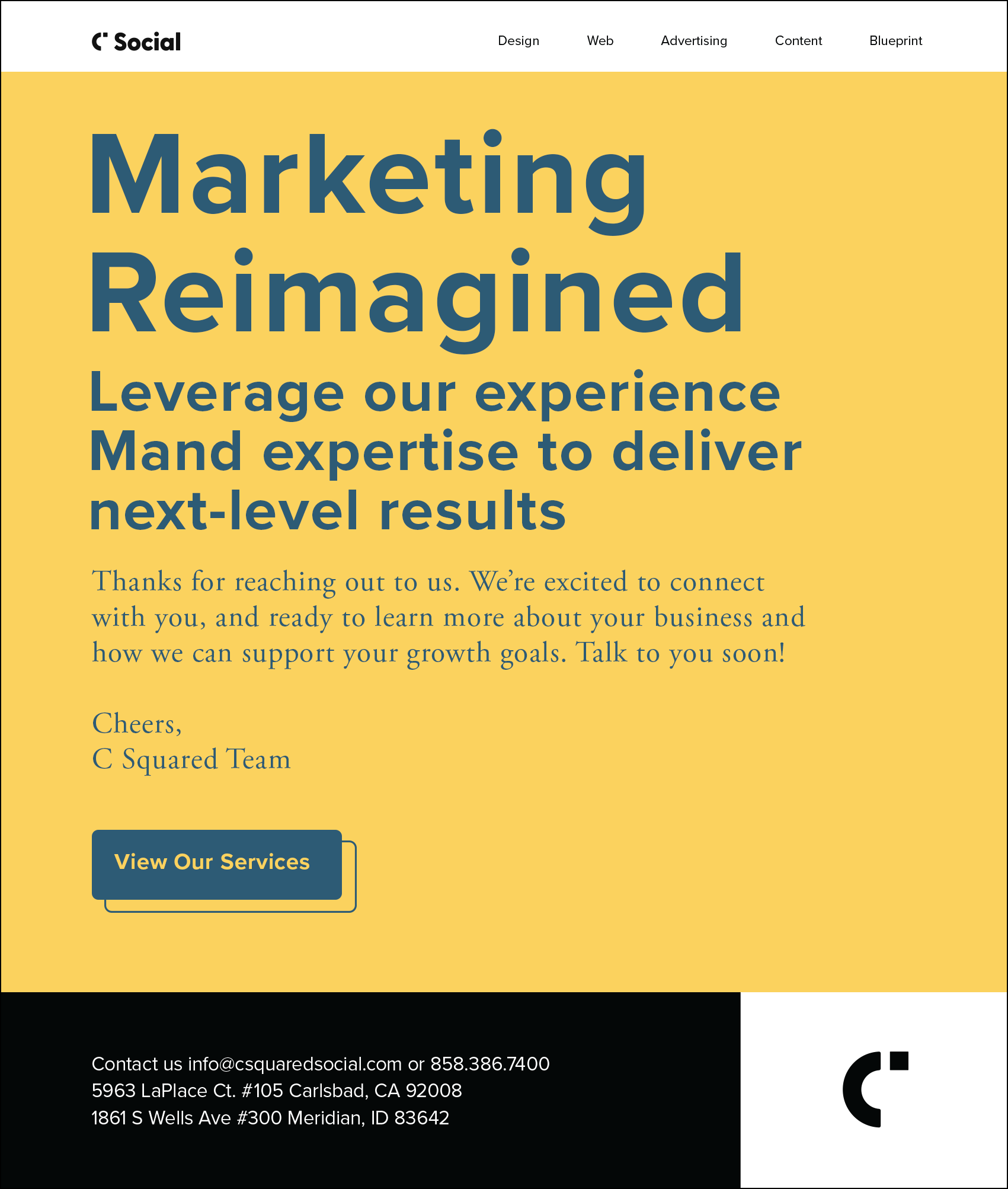
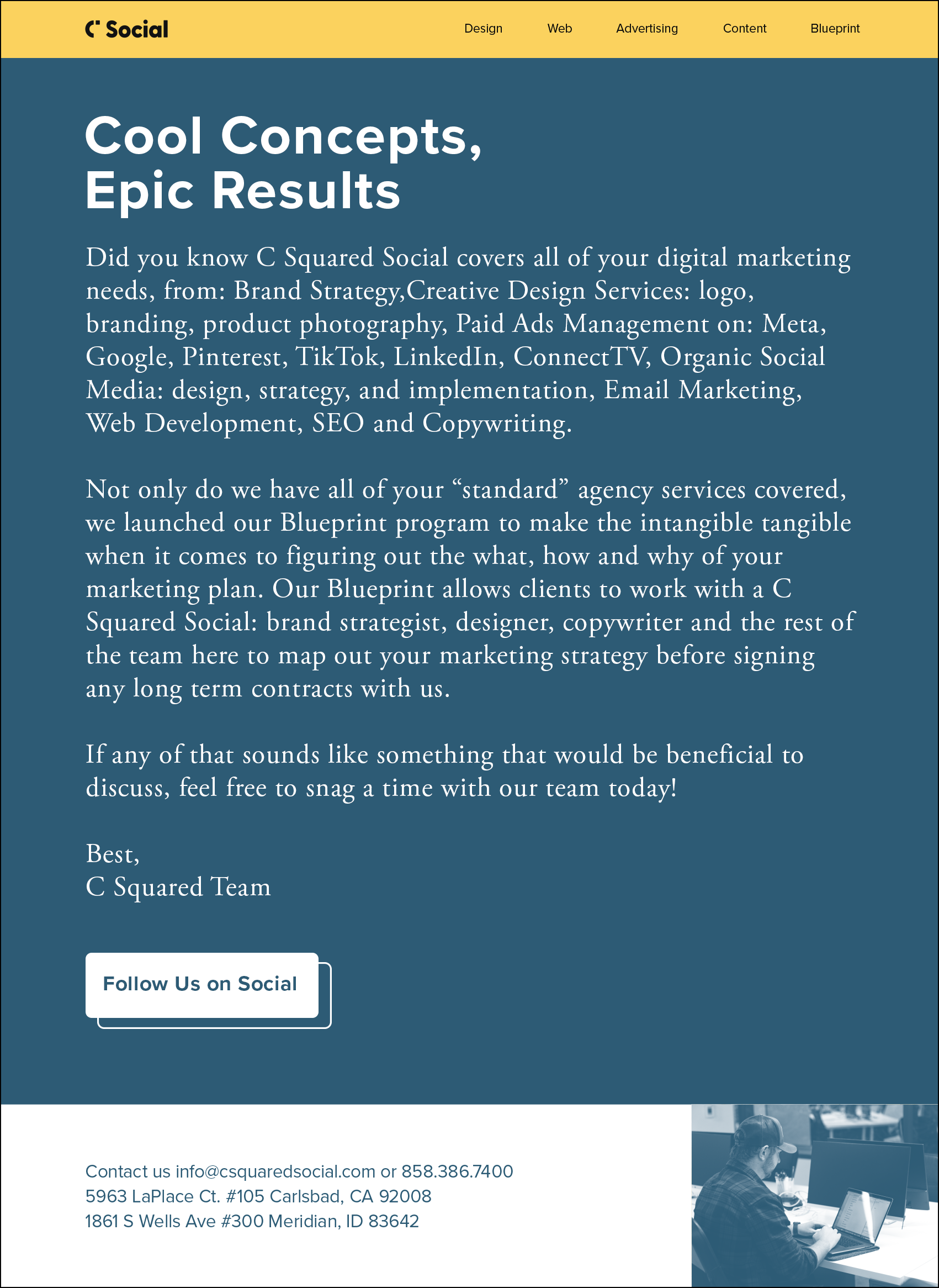
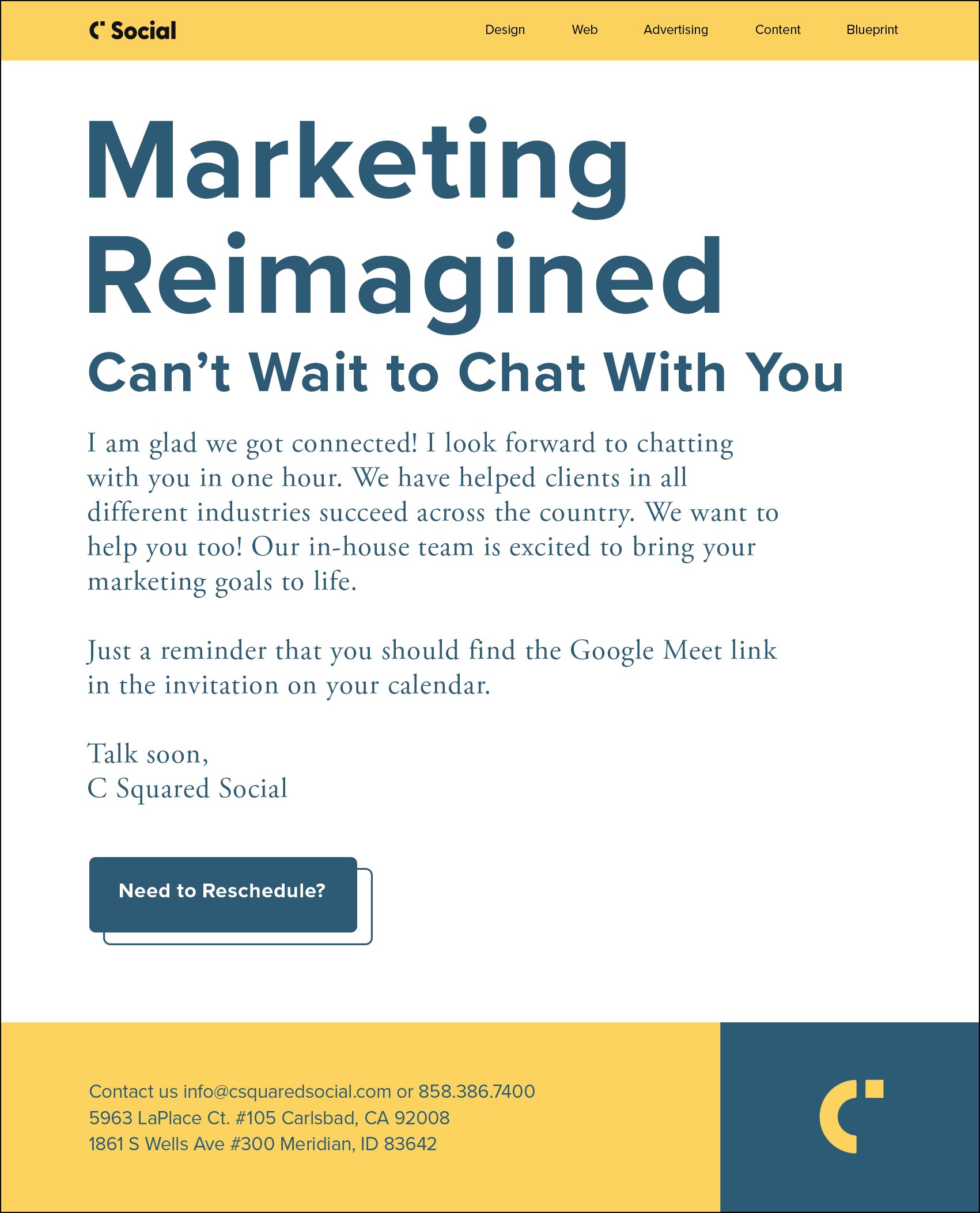
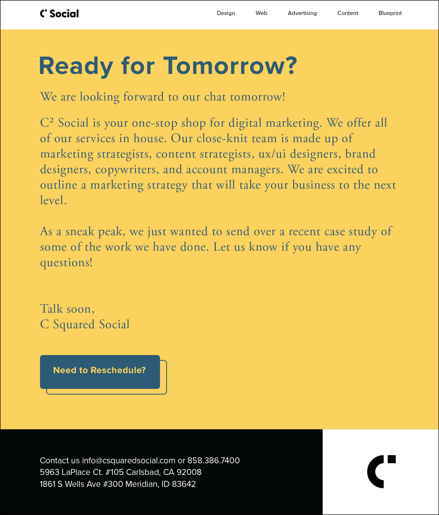
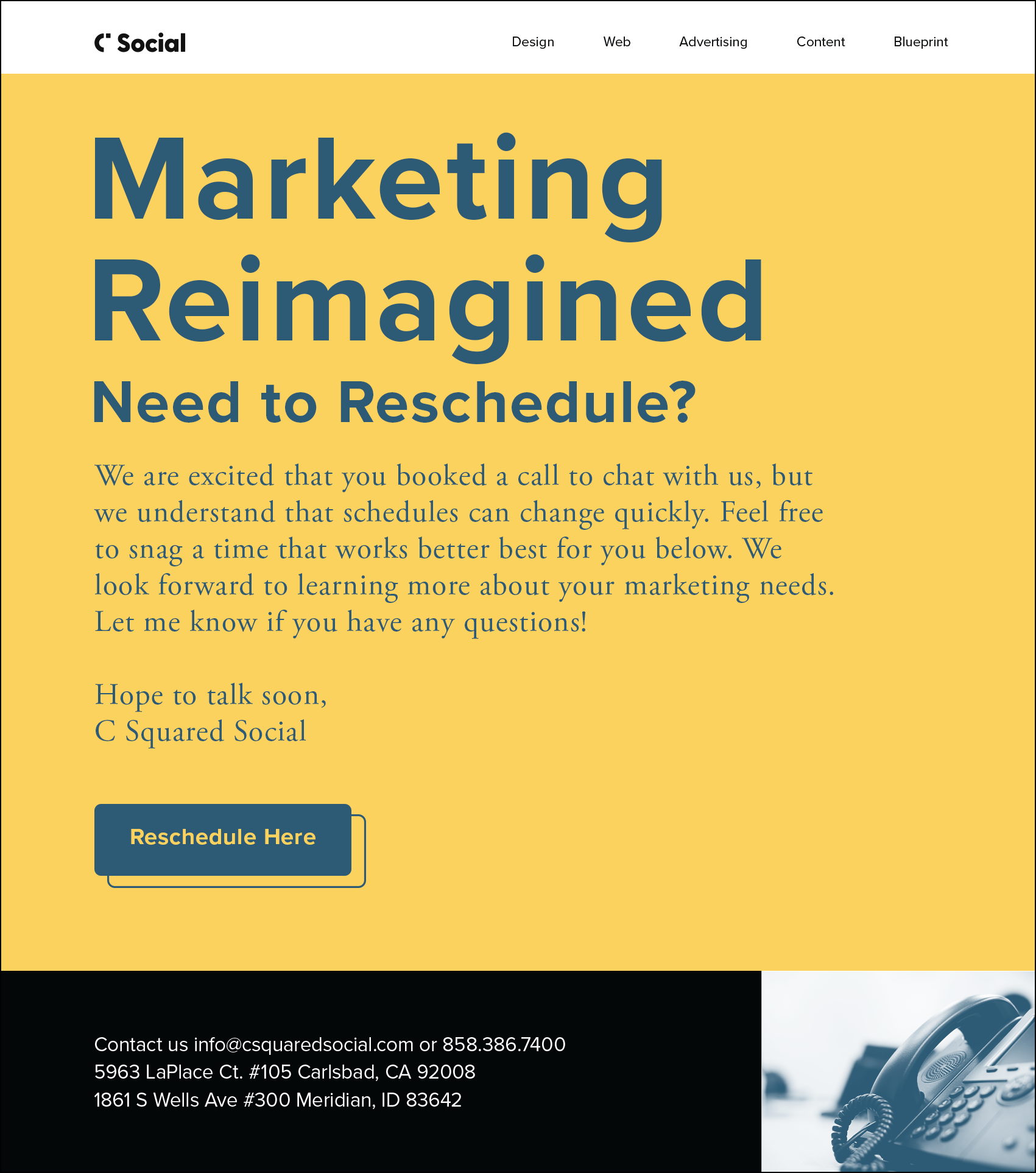
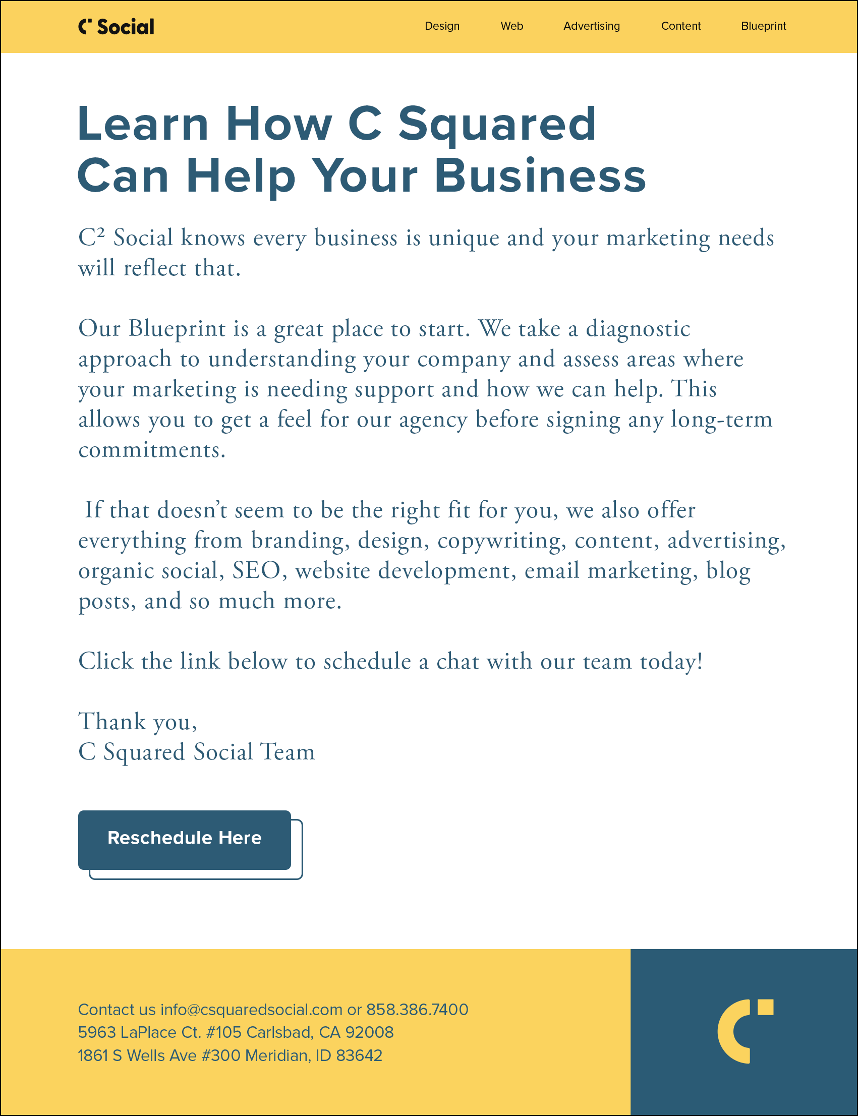
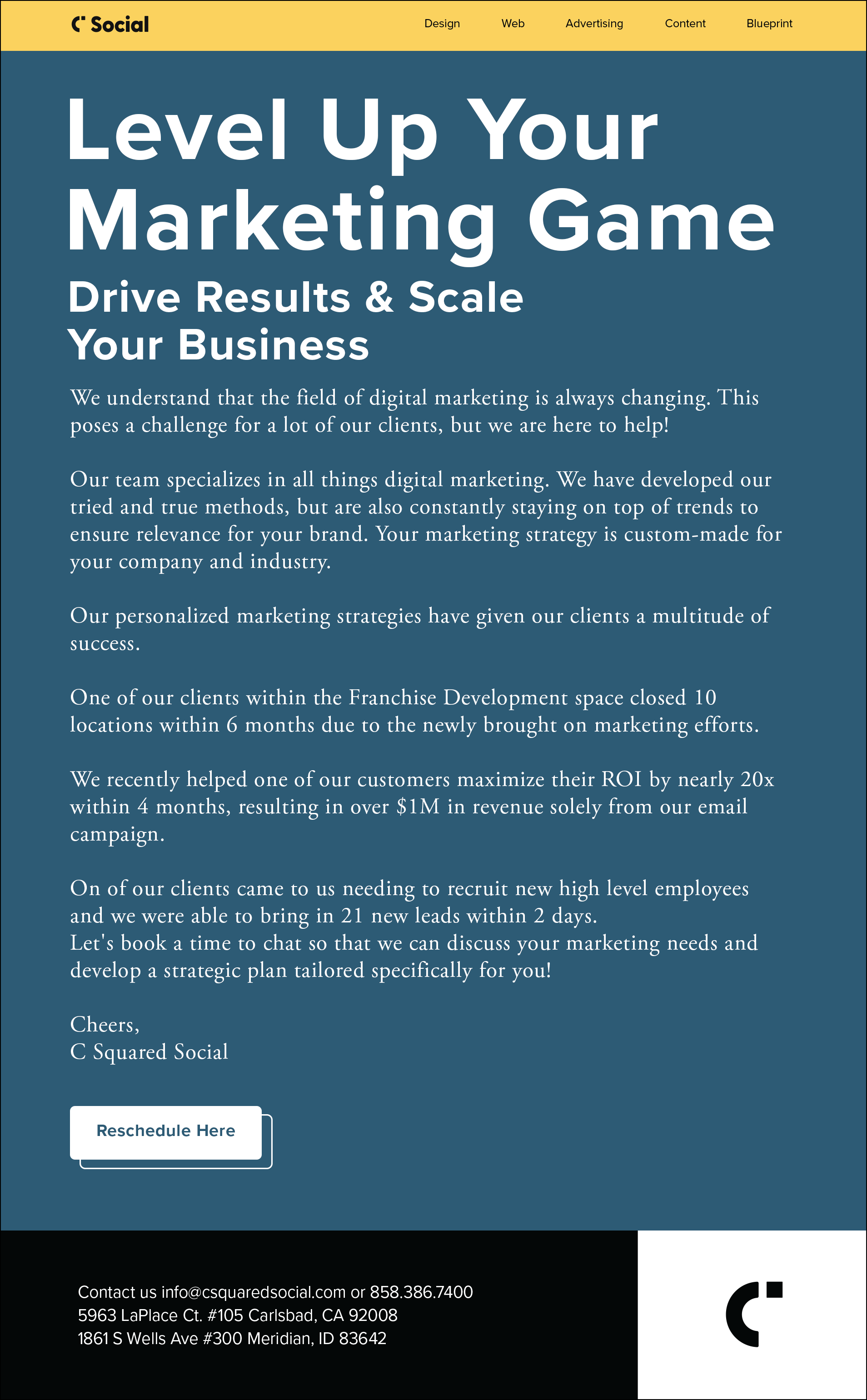
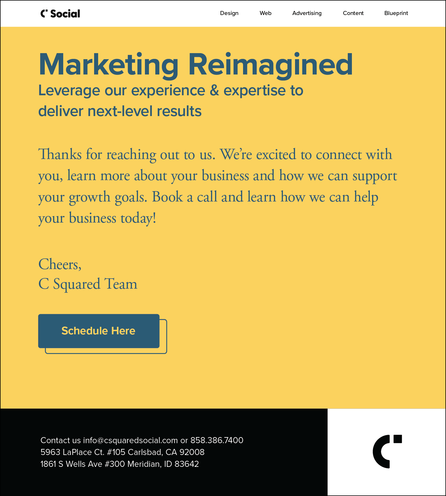
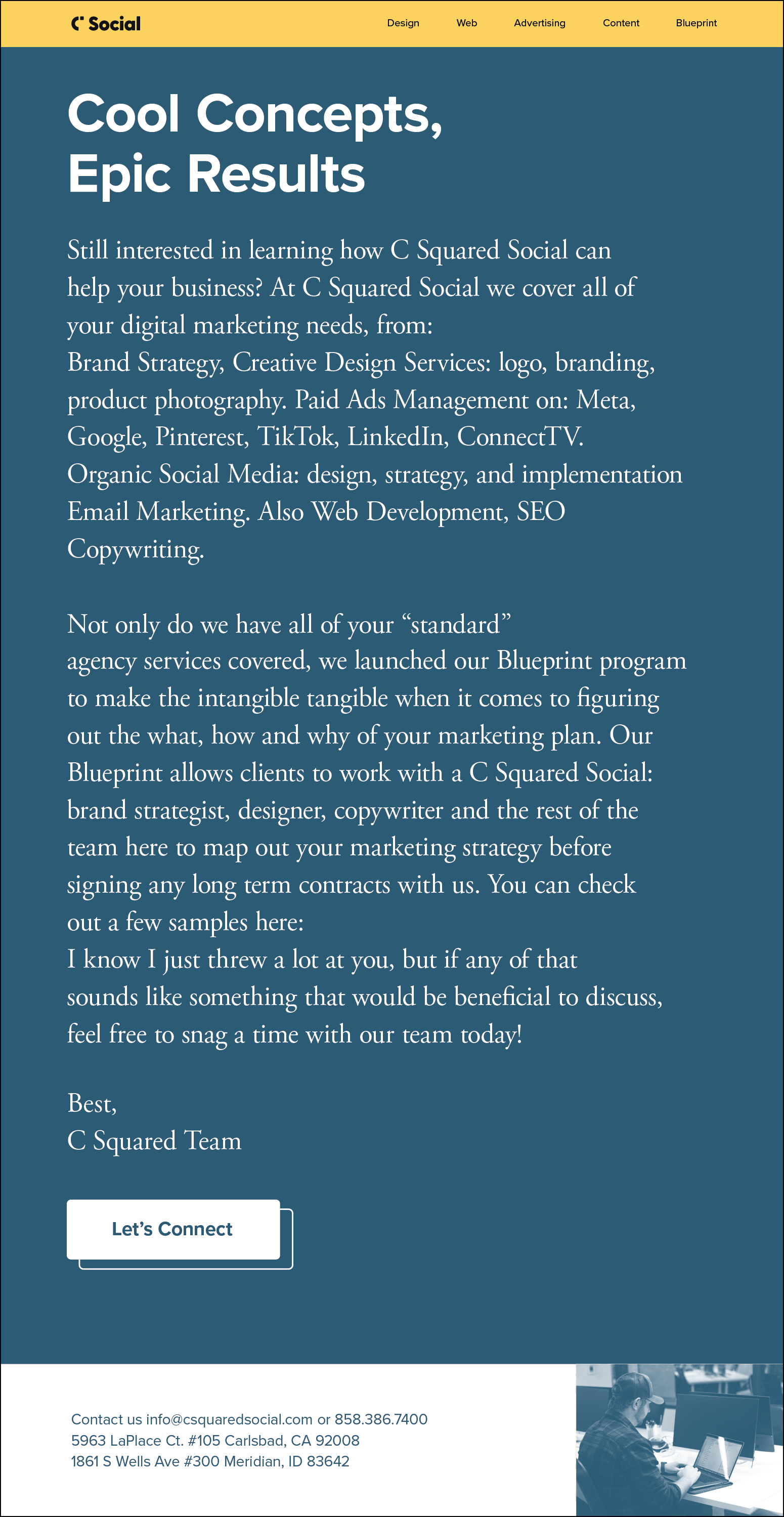
These are internal emails for the company that would go out to our clients and potential customers.
Duration & Deliverables & Tools
Each month, the creation of these emails typically took about 2-3 days due to an approval process involving the lead internal designer, creative director, and content marketing director. I produced 4-5 emails monthly, using Illustrator and Photoshop for design, and then they were integrated into Klaviyo for distribution.
Concept and Production
The concept behind the emails was to attract new and potential clients. We made sure to have the emails be very minimal and simple, not to distract or overwhelm, while still having a strong brand identity and message. The emails always made sure to touch on results and education and make clients aware of the services we could provide. The production of the emails had a strict and rigid structure to follow and tended to be a templated version to ensure consistency in the design across the board.